Good Example of a Window Display
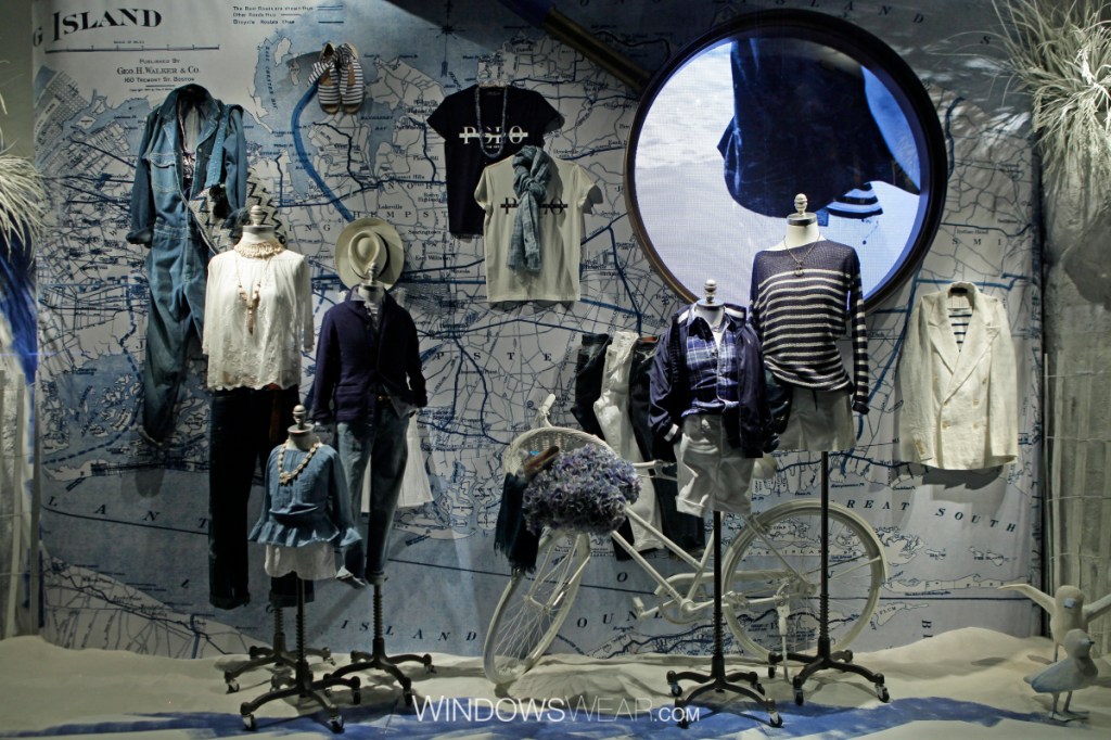
In my opinion, this window display is a good example of the use of design elements and principles. The color coordination used is between different shades of blue, white and black. The color used tells a story of travel and to me, represents the east coast along with nautical aspects. A sense of direction is successful in that the eyes move up and around in a diagonal manner that leads to viewing all clothing that is displayed. Finally, lines are utilized as a design element. For example, the map in the background has lines all over to represent means of travel and state division which sub sequentially creates movement. All these principles and elements combined result in a unified and cohesive design. Overall, I find this visual merchandising display to be visually aesthetic and would lead me to enter the store to check out the merchandise that is being sold.
Bad Example of a Window Display
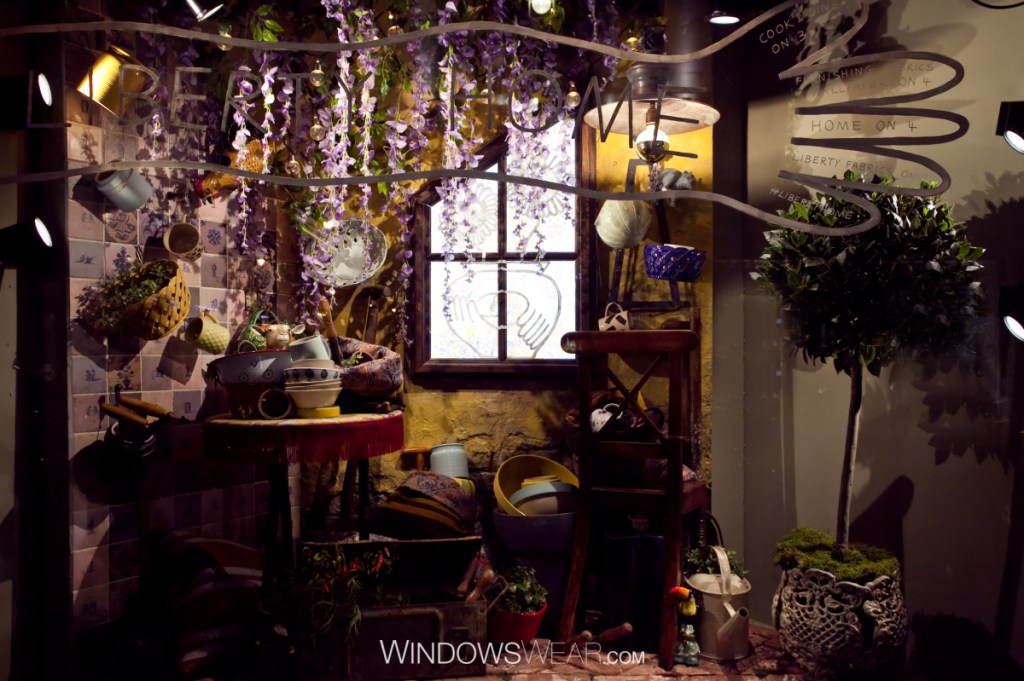
This window display is an example of a display that slightly missed the mark when it comes to correctly utilizing design techniques. Personally, I think this display’s concept is interesting, but it was done messily. There is no visual balance present and left side seems to weigh heavier over the entire design, leaving the right side to appear emptier than it actually is. It may have been beneficial to place all the props in the middle and towards the bottom of the space so the top could be occupied by more purple flowers dangling down. Furthermore, there is a lack of rhythm because all the prop dishware is strewn about the display in a distraught manner. I like that looking at this display makes me think of a french farmhouse, but it could have been executed differently in order to be successful.
