Good Example of a Window Display
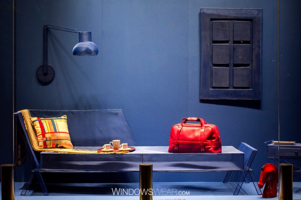
This is an example of a good window display because it utilizes design principles and elements in the correct way. Color is the main element chosen to be used in the display and plays a large role in the entire design. Primary colors (blue, red and yellow) were selected and create a visual balance. Navy is the base color used on the wall and main props (couch, lamp, and art piece), while red and yellow are incorporated in the accessories that are to be sold. This also allows for the principle of contrast to be utilized with warm and cool tones present. Squares seem to be significant in this display due to its continual appearance. Finally, emphasis is placed on the red bag on the right side of the display and this is because it is the most well lit item in the display.
Bad Example of a Window Display
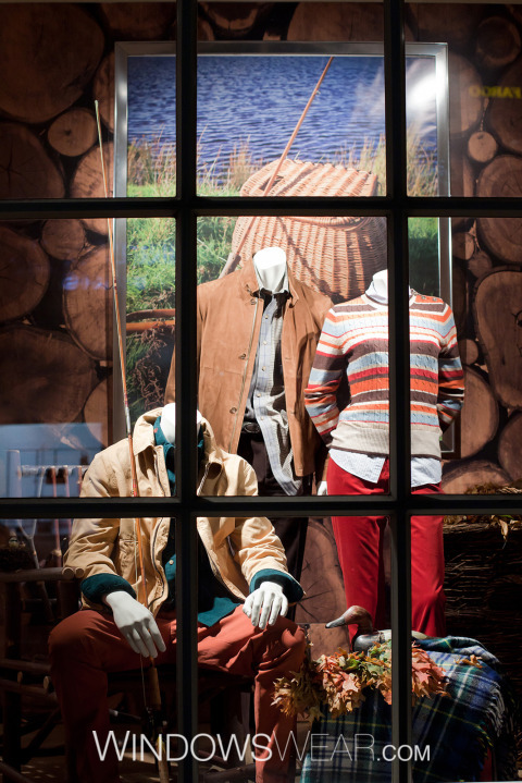
This window display is a bad example of one due to the lack of correctness while using the design techniques. Overall, this display is crowded and visually confusing and unaesthetic. The window panes are blocking the entire display, preventing a full showcase of the product. The placement of the mannequins create a sense of disproportional imagery. I think it would have been more beneficial to have a child mannequin form sitting for more balance. The color story is odd because jewel tones, bright tone and neutrals which does not make sense in a design aspect. Emphasis is placed on the picture in background and it is nothing special-just a wicker basket. I think it would have been more important to put the emphasis on the merchandise. To conclude, if a different approach had been taken, this display would have been more successful in terms of design unity.
