Good Example of a Window Display
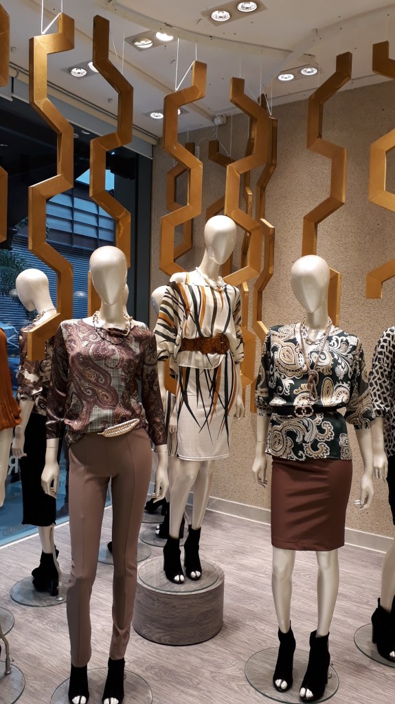
This is an example of a well done window display due to the correct use of key design elements and principles. The use of color is successful by incorporating various shades of brown, black and white. This display utilizes shape in many ways. The circular bases are used to make the display flow and the hexagonal shapes create a sense of movement. It is interesting that the company decided to extend the display from the window and throughout the store, taking advantage of a ll possible space. Overall, this display is harmonic.
Bad Example of a Window Display
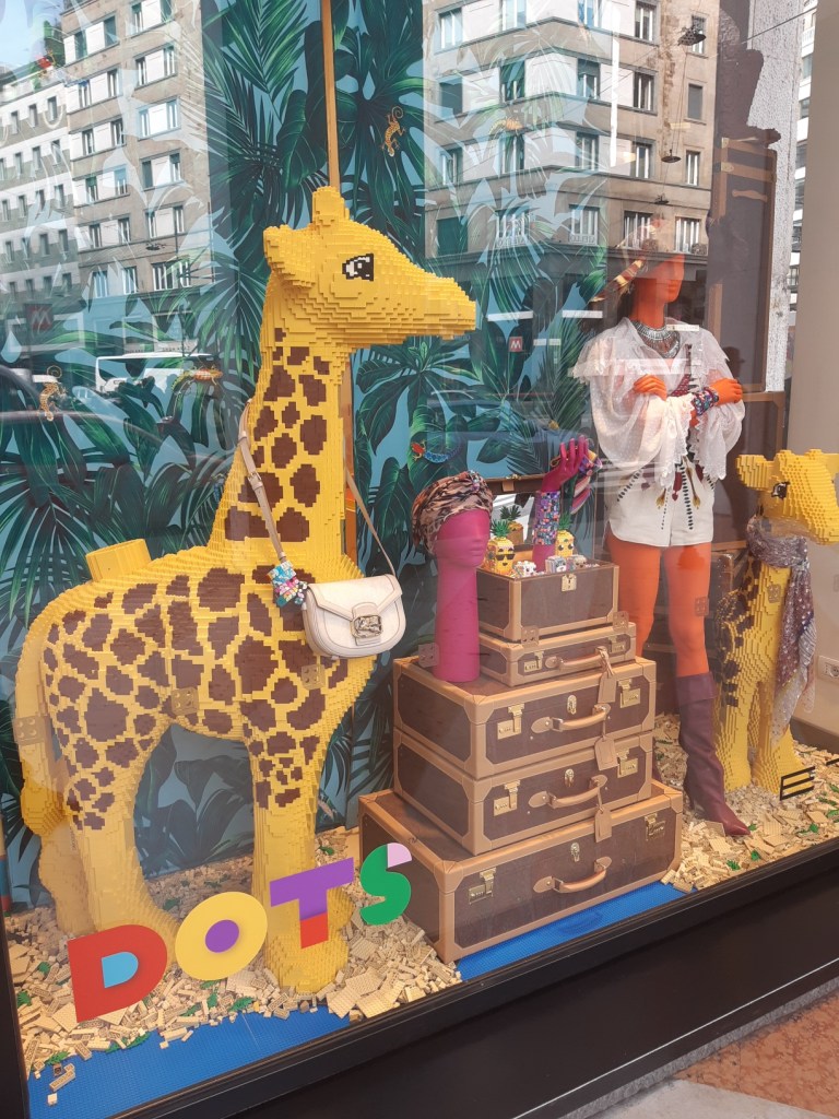
This is an example of a bad window display for many reasons. I do not think there is a clear theme or target audience this display is hoping to achieve. It could be directed to kids, with the use of legos, or to adults, through the clothing and accessories which is more evident. For the company, I think it would be beneficial that they clarify who their intended viewer would be. This display is also very busy and has many components that could have been avoided. The use of many different colors that somewhat coordinate, but again it comes across childish when I think it was not meant to be that way. It seems unproportional since giraffes are much larger usually and I feel as if more space could have been taken up by using taller giraffe props. Overall, this display is confusing to me.
