Good Example of a Window Display
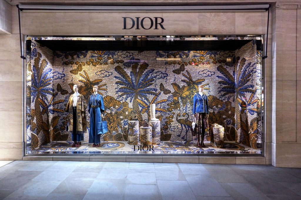
This Dior window display presented above represents an example of a well put together display that would stop anyone who passes it in their tracks. The use of blue, gold and white is an interesting choice that gives a Greek and African vibe, two places you typically would not associate. The texture of the tiles on the entire background add dimension and tell a story. Sequence is another design element which is used excellently in this display by the addition of the three palm trees in the background. I moved my eyes from left to right to look for what is in front of each of the palm trees. One thing I like about this display is that there are no clear lines. There is a lot to look at, but it remains visually appealing. Overall, this Dior window display exudes total unity and harmony.
Bad Example of a Window Display
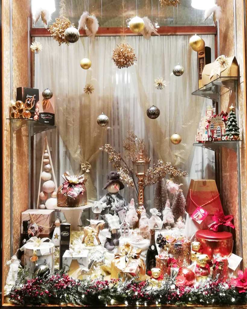
This is a bad example of a window display for multiple reasons. Overall, there is just too much going on at once and there is no sense of harmony. Various colors were used throughout the display such as red, pink, gold, white, and gray. While some of these colors match, there is no thought behind the placement to make a cohesive display. Also, there is no clear direction or lines that add movement to the window, it is all just scattered. Finally, the element of surprise as a principle of design is frequently present. Examples are the snowman, the miniature street lamp, and the angel wings that are hung above as a fixture. In my opinion, this is a poorly constructed window display that would be very confusing to the consumers eye, which is not the goal of a successful window display.
