Good Example of a Window Display

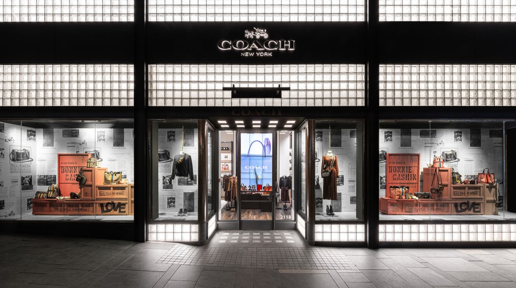
In my opinion, the photo above is an example of a well-done window display that will entice customers to enter the store. There are various design elements and principles of designs correctly in this specific window display for Coach. The color story absolutely works in this design-green, orange, black and white are prevalent and gives the display an industrial/street look. Texture is represented with the use of the wooden crates which are a focal point of the display and also add to the industrial vibe. Two other design elements that make this display work are line and shape. These two go hand-in-hand because the lines are strictly horizontal and vertical, which coincides to the square and rectangles used. Squares and rectangles are present in the exterior of the building, the entrance walkway, the background, and the crates. These shapes tie the entire look together creating unity-the first design principle used in the display. Balance is used in both sides of the display establishing symmetry. Another rule applied is emphasis. This is represented by the main focal point- the blue purse because of the vibrant, cool color compared to the other warm tones. Finally, the last design principle used is contrast. Black and white are heavily used in the overall store front creating the simplest form of contrast.
Bad Example of a Window Display

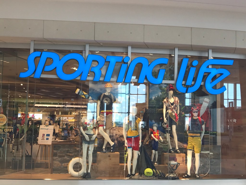
This photo is an example of a bad window display for multiple reasons. The correctness of the design elements are lacking and the principles of design are not utilized efficiently. Primary colors were the colors chosen for this window display’s theme, however, there are other random colors and different shades of the primary colors. For example, the neon yellow tennis ball is the wrong yellow compared to the mustard yellow pieces and this creates visual chaos. In my opinion, the shapes used are an odd choice. There are square boxes which the mannequins are standing on, but the rest of the shapes used are circular and round objects. I am curious as to why the visual merchandiser decided to place the lifesaver, tennis ball, and bicycle wheel in a row in the front. Also, the size of the props do not make any sense because each prop seems extremely small next to the mannequins. Balance is used incorrectly because there is one small child mannequin and the rest are adults. I think the left side of the window display could have used another child mannequin to create necessary balance. Finally, the emphasis is put on the blue sign that says “Sporting Life” and it seems to be outshining the display itself.